Cover 1st Draft
- Ruzgar Saylam
- Apr 14, 2025
- 1 min read

Updated: Apr 20, 2025
With our final magazine's coming up in a few weeks, we had to create some drafts of our different pages that will be in our magazine. For this blog post, it is the cover. The cover is always what you first see on a magazine when you pick it up no matter what. It contains the headlines and contents that will be included inside of the magazine, using fonts and colors that might catch your attention. From my research and the time I have spent in this class, these drafts are what I came up with during the process time of a few days. We have shared them in class and have gotten opinions on what we should change and what we should keep.
Version 1 and 2 -


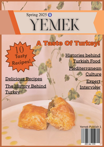
From these 2 versions of covers, I've taken more favor towards the second version because, It seems more professional and clear to read unlike the first one. While the first one is pretty, it was too busy, the colors didn't match, the sizes of the headlines and the different fonts didn't seem to go with the cover at all, and some words like the title were hard on the eyes. With the second version, it matches a certain color scheme while still looking clean and formal. The headlines are bold and the title is readable, the image seems to be closer while the puff is more noticable. The cover line is also more identifiable. Both of the versions have barcodes, and both also include the dateline. They were also created in the same format, Canva. So going forward, I've decided to go with my second version.


Comments